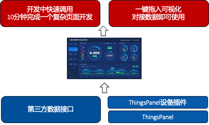
Dependent Plugins
Dependent Plugins are development schemes for building various industry solutions, or Industry Building Blocks.
Advantages of Dependent Plugins:
- Rapid Solution Assembly, more efficient than low-code.
- Separation of Solution and Platform, completely separating the personalization layer from the standard general layer.
- Decoupled Parallel Development, maximizing speed for large-scale project parallel development.
- Cross-project Reuse, can be directly copied, installed, and referenced between different projects.
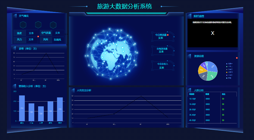
Example
A Firefighting Unit dependent plugin contains functions and interface units for monitoring and managing equipment such as generators, energy storage batteries, and water pumps.
In any project requiring firefighting units, such as smart buildings, this firefighting unit plugin can be directly installed. Chart components, reports, and dashboards related to this unit management will be loaded and reused at once. Therefore, it greatly saves development time.
Dependent Plugin Dependency Diagram
How to Develop Dependent Plugins
Develop visual plugins according to ThingsPanel Visual Plugin Development Standards. Refer to: Visual Plugin Development
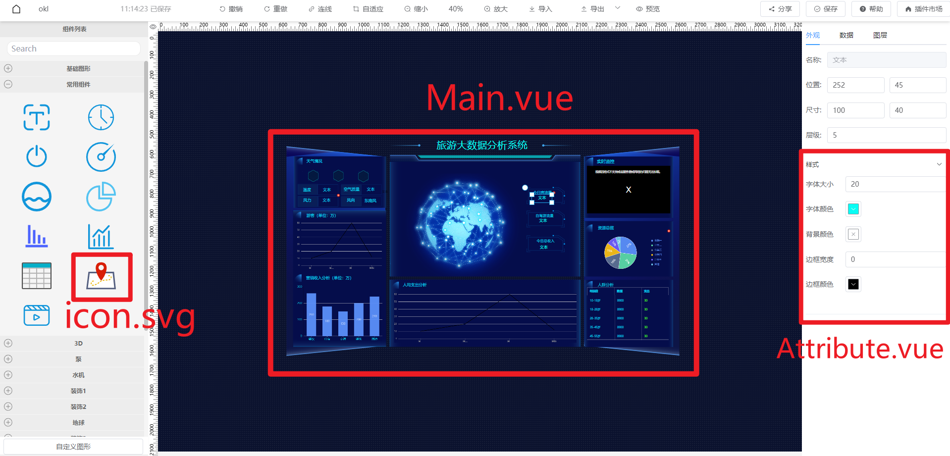
As shown in the figure, this is a Tourism Big Data Analysis System plugin.
Development Effect Example:
A visual plugin view mainly consists of 3 parts:
- Draggable icon view icon.svg in the left component list
- Node view Main.vue displayed on canvas after dragging
- Style view Attribute.vue and Data view Data.vue in the right panel
Development Steps:
- Create a
travel-pluginfolder in the project'ssrc/pluginsdirectory as the main directory for the tourism analysis system plugin. - Create a
travelfolder undertravel-plugin. - Create
Main.vue,Attribute.vue,Data.vue,index.tsundertravel. - Put the prepared
icon.svgfile into thetraveldirectory. SVG files can be downloaded from https://www.iconfont.cn/
Directory structure:

- Write the main view of the plugin in
Main.vue, refer to the effect example. - Write the configuration style panel in
Attribute.vue, as shown:
Attribute.vuecode:
<template>
    <el-collapse v-model="activeNames">
        <el-collapse-item title="Style" name="style">
            <el-form v-model="formData" label-width="80px" label-position="left">
                <el-form-item label="Font Size">
                    <el-input type="number" v-model="formData.fontSize"></el-input>
                </el-form-item>

                <el-form-item label="Font Color">
                    <tp-color-picker v-model="formData.color" />
                </el-form-item>

                <el-form-item label="Background">
                    <tp-color-picker v-model="formData.backgroundColor" />
                </el-form-item>

                <el-form-item label="Border Width">
                    <el-input type="number" v-model="formData.borderWidth"></el-input>
                </el-form-item>

                <el-form-item label="Border Color">
                    <tp-color-picker v-model="formData.borderColor" />
                </el-form-item>
            </el-form>
        </el-collapse-item>
    </el-collapse>
</template>

<script>
export default {
  components: {},
  props: {},
  data() {
    return {
        formData: {
            fontSize: 20,
            color: '#000000',
            backgroundColor: '',
            borderWidth: 0,
            borderColor: '#000000'
        }
    }
  },
  methods: {}
}
</script>
<style lang="scss" scoped></style>
- Write the data binding panel in
Data.vue, as shown:
Data.vuecode:
<template>
  <div style="height:100%">
    <el-row style="margin-bottom: 10px">
        <el-radio-group v-model="formData.bindType">
          <el-radio v-for="item in bindOptions" :label="item.value" size="small">{{ item.label}}</el-radio>
        </el-radio-group>
    </el-row>
    <el-row style="height:100%">
        <!-- Static Data -->
        <el-input v-if="formData.bindType==='static'" :rows="20" type="textarea" v-model="formData.static"></el-input>
        <!-- Dynamic Data -->
        <el-form-item v-else-if="formData.bindType==='dynamic'" style="width:100%">
          <el-input :rows="2" type="textarea" v-model="formData.dynamic"></el-input>
        </el-form-item>
        <!-- Device Data -->
        <div class="w-full" v-else-if="formData.bindType==='device'" >
          <slot></slot>
        </div>

    </el-row>
  </div>
</template>

<script>
export default {
  components: {},
  props: {},
  data() {
    return {
        formData: {}
    }
  },
  methods: {}
}
</script>
<style lang="scss" scoped></style>
- Export components in
travel/index.ts:
import Travel_Attribute from './Attribute.vue';
import Travel_Data from './Data.vue';
import Travel_Main from './Main.vue';
import Travel_Icon from './icon.svg';
export { Travel_Attribute, Travel_Data, Travel_Main, Travel_Icon }
- Export and configure plugin properties in
travel-plugin/index.ts:
import { Travel_Attribute, Travel_Data, Travel_Icon, Travel_Main } from "./travel";

export default {
    views: [
        {
            name: "travel",
            description: "",
            group: "Tourism Analysis Plugin",
            size: { width: 200, height: 100 },
            icon: Travel_Icon,
            Main: Travel_Main,
            Attribute: Travel_Attribute,
            Data: Travel_Data
        }
    ]
}
- Export plugin in
plugins/index.ts:
// ...
import travelPlugin from './travel-plugin';
export default {
    travelPlugin,
    // Export other plugins
}
- Now you can start the project to view the effect.
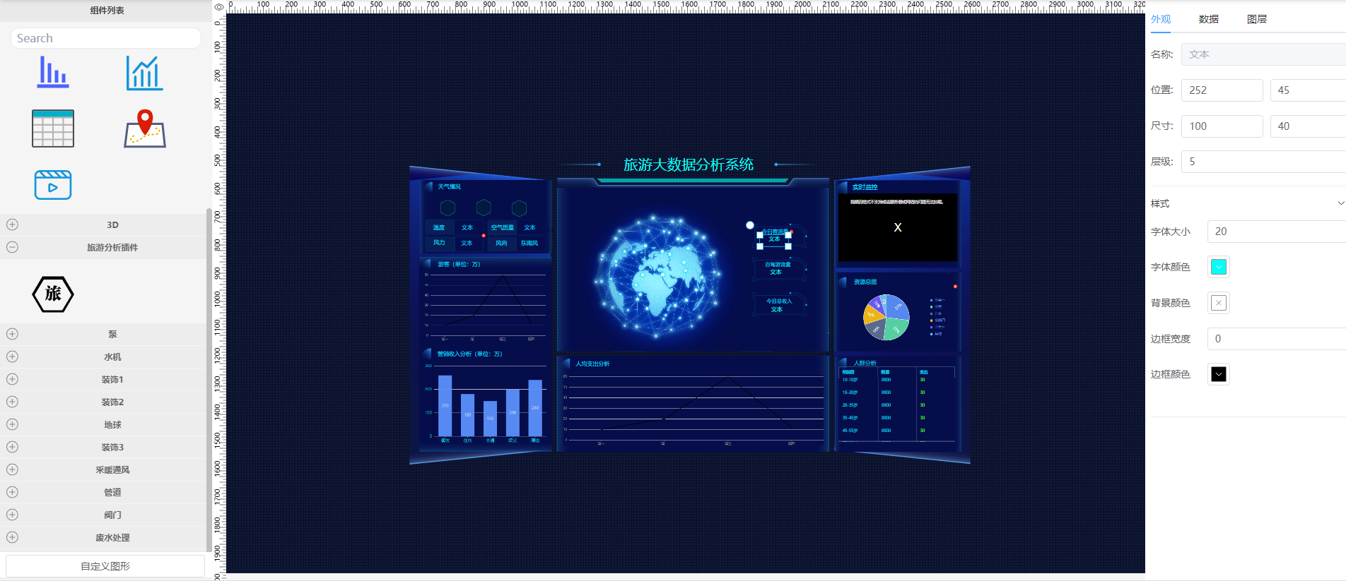
Run
pnpm run devin the project root. Openlocalhost:5173/editorin browser. Find the Tourism Analysis Plugin in the left component list group. Drag the component to the canvas:
Data Interaction
Interaction during Editing
When user configures style or binds data in the right panel, it needs to interact with the node on canvas.
- Style Interaction
When data in
Attribute.vuechanges, emit the changed style data:
this.$emit("onChange", { style: { ...val }});
Attribute.vue example:
data() {
    // ...
},
watch: {
    formData: {
        handler(val) {
            this.$emit("onChange", {
                style: { ...val }
            });
        },
        deep: true
    }
}
Then listen for style data in Main.vue:
props: {
    style: {
        type: Object,
        default: () => ({})
    }
},
watch: {
    style: {
        handler: function (val, oldVal) {
            if (JSON.stringify(val) === "{}") return;
            console.log(val);
            // Code to execute after style change
        },
        immediate: true,
        deep: true
    }
}
- Data Binding Interaction
When data in
Data.vuechanges, emit the changed data:
this.$emit("onChange", { data: { bindType: this.bindType, ...val }});
Data.vue example:
<script>
export default {
  data() {
    return {
      formData: {
        bindType: 'static',
        static: "Text"
      },
      bindOptions: [
        { value: 'static', label: 'Static Data' },
        { value: 'dynamic', label: 'Dynamic Data' },
        { value: 'device', label: 'Device Data' }
      ]
    }
  },
  watch: {
    formData: {
      handler(val) {
        this.$emit("onChange", {
          data: { bindType: this.bindType, ...val }
        });
      },
      deep: true
    }
  }
}
</script>
Listen in Main.vue:
<script>
export default {
  props: {
    data: {
      type: Object,
      default: () => ({})
    }
  },
  watch: {
    data: {
      handler(val) {
        if (JSON.stringify(val) === "{}") return;
        console.log(val);
        // Code to execute after data change
      },
      deep: true,
      immediate: true
    }
  }
}
</script>
Interaction during Viewing
When user previews or views the visualization, sometimes you want to pass data to the editor (or player).
For example, a button in Main.vue. When clicked, notify the editor.
this.$emit('change', DATA_TO_PASS)
Example:
<template>
  <div style="width:100%;height:100%;">
    <el-button @click="handleClick">Button</el-button>
  </div>
</template>

<script>
export default {
    // ...
    methods: {
        handleClick() {
          this.$emit('change', "hello")
        }
    }
}
</script>
Receive in onChange method in src\display\components\DisplayComponent.tsx:
methods: {
    onChange(value: any, _callback: any) {
        console.log(value)
    }
}
Click preview, open console, click button.

How to use Dependent Plugins
- Create the device plugins that dependent plugins rely on.
- Install the dependent plugin in App Management.
- Create and access devices to successfully collect data.
- Open Visualization, drag in the dashboard or chart components included in the dependent plugin.
- Click the component, bind data.
- Use normally.