Dashboard Card Development
Quick guide to Dashboard Card development.
I. Introduction to Dashboard Cards
1. What is a Dashboard Card?
A Dashboard Card is a component used to build ThingsPanel pages. It can be a digital indicator, a curve, or a table.
2. How to use Dashboard Cards?
1) Create/Edit Dashboard Card
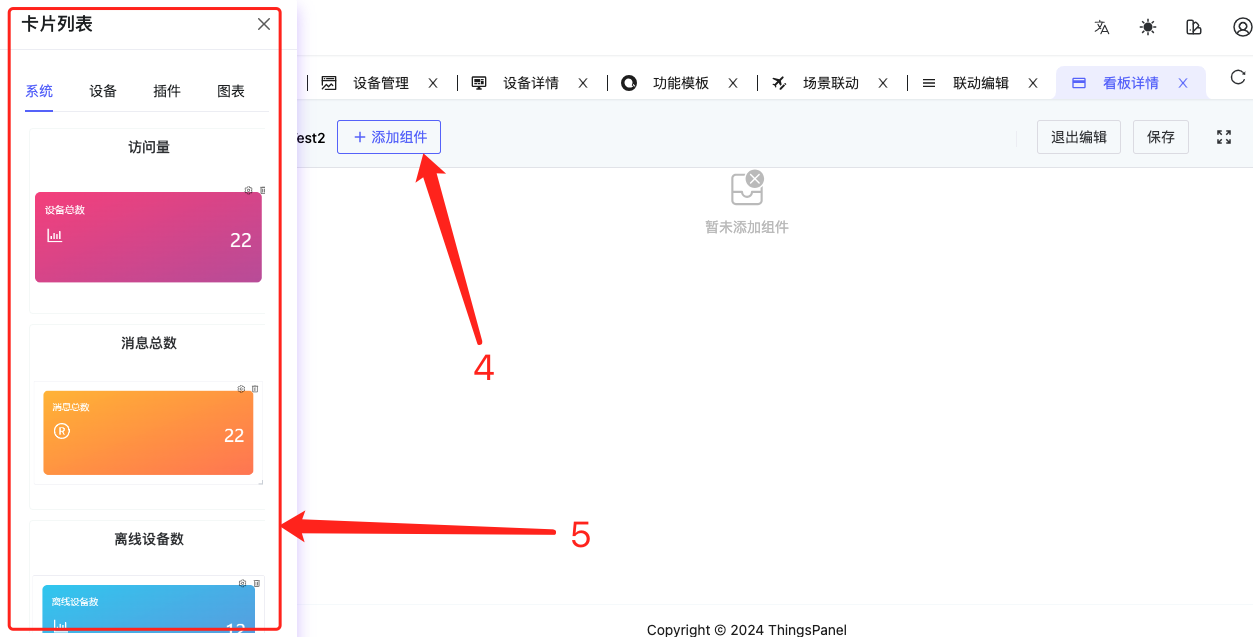
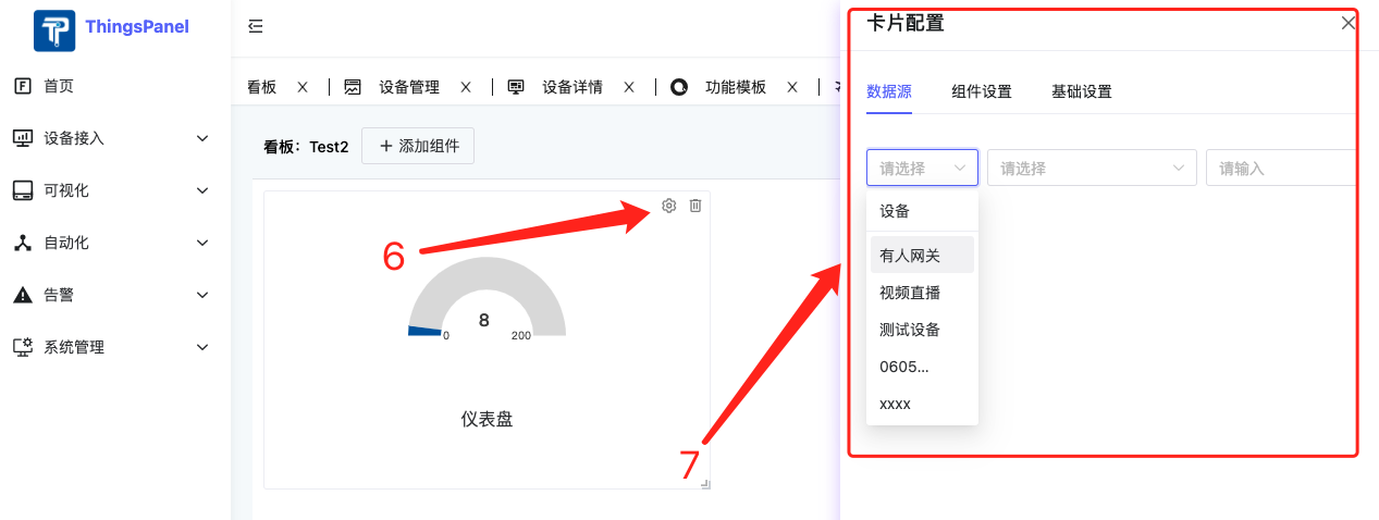
2) Dashboard Card Usage
We can use Dashboard Cards in 3 places:
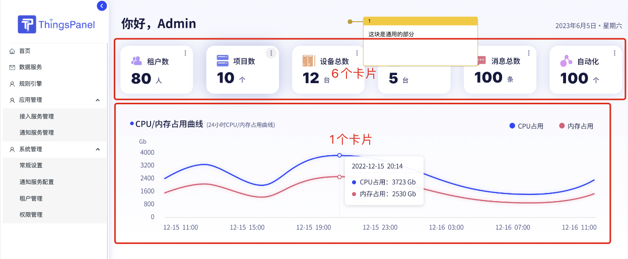
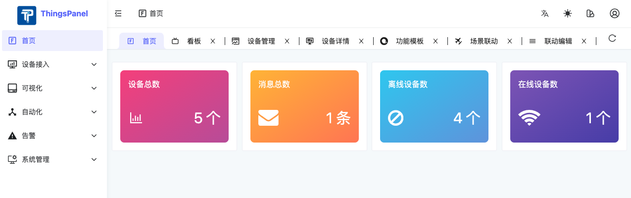
- Home Page
- Device Model Web Chart Configuration (Chart Cards only)
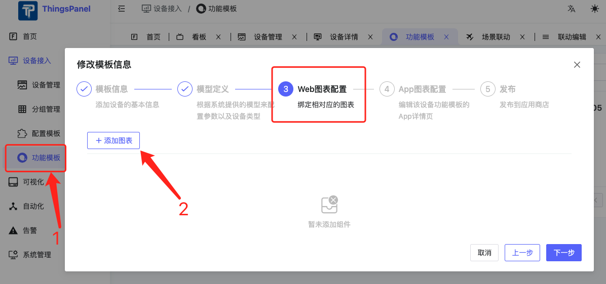
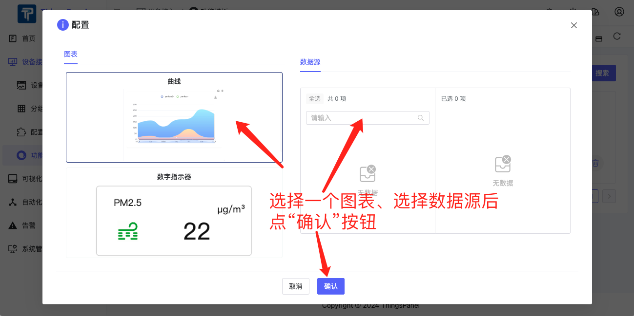
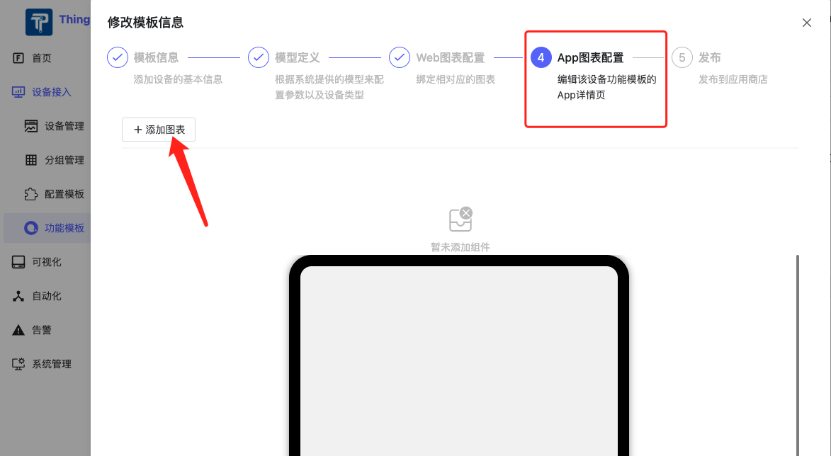
- Device Model App Chart Configuration (Chart Cards only)
II. How to Develop Dashboard Cards
1. Determine Card Type
Dashboard Cards are currently divided into 2 types: System Card and Chart Card. Only Chart Cards can be used in Device Model Web and App chart configurations.

2. Create Folders and Files for Development
Generally includes 4 files (reference demo: /src/card/chart-card/demo):
demo
  - index.ts // Export directory: defines card name, id, type (builtin: system card, chart: chart card), preset args, icon, etc.
  - component.vue // Card component
  - card-config.vue // Card config form (optional if no config needed), collects card specific properties
  - poster.png // Card thumbnail, size 236*148
Note: Cards are automatically loaded without extra import.
3. Data Acquisition and Storage
1) How to save data in Card Config Form (card-config.vue)
The card config form collects user configuration. The upper layer passes a ctx object to collect data:
const ctx = inject<IConfigCtx>('config-ctx')!;
Information to be saved should be stored in the ctx.config object. For example, to save a selected color:
<NColorPicker v-model:value="ctx.config.color" :show-alpha="false" />.
2) How to get config info in Card Component (component.vue)
In the card component, get config info via props.card.config.
For example, to access the color saved above:
<NIcon class="iconclass" :color="props?.card?.config?.color || 'black'">.
3) Device Data Acquisition
When developing a Chart Card, you need to fetch device data. There are 2 ways:
- HTTP: Fetch historical data via
/telemetry/datas/current/keys. - WebSocket: Fetch real-time data via WebSocket API.
We have encapsulated the method to request device data via WebSocket in the upper layer. You only need to implement an
updateDatamethod in the card. The upper layer will call this method to pass the latest data:
defineExpose({
  updateData: (_deviceId: string | undefined, metricsId: string | undefined, data: any) => {
     detail.value = metricsId ? data[metricsId] : '';
  }
});
4. Precautions
1) Responsiveness
Card size is editable by users. Card UI design must follow Responsive UI design principles. If the card cannot display normally when too small, please set minW and minH to ensure minimum rows/columns during editing. Specific specs:
- Avoid absolute units: Avoid px for width/height/margin. Use relative units like %, vw, vh, em/rem.
- Fluid Layout: Use percentage width instead of fixed width.
- Flexbox or Grid: Use Flexbox for 1D layout and Grid for 2D layout to adapt to container size.
- Media Queries: Use CSS media queries to define styles for different sizes.
- Responsive Images: Use
max-width: 100%; height: auto;. - Flexible Font Size: Use relative units (em, rem) for font size.
2) Card Thumbnail (poster.png)
After development, take a screenshot and save it to the current card directory.
5. Example
Taking "Digital Indicator" card as an example, its 4 files are:
1) Export Directory index.ts
import { defineAsyncComponent } from 'vue';
import poster from '@/components/panel/chart-card/demo/poster.png';
import type { ICardDefine } from '@/components/panel/card';

export default {
  id: 'chart-demo',
  type: 'chart',
  component: defineAsyncComponent(() => import('./component.vue')),
  poster,
  title: 'Digital Indicator',
  configForm: defineAsyncComponent(() => import('./card-config.vue')),
  preset: {
    dataSource: {
      origin: 'device',
      sourceNum: 1,
      systemSource: [{}],
      deviceSource: [{}]
    },
    config: {
      name: '123'
    },
    iCardViewDefault: {
      w: 5,
      h: 3,
      minH: 1,
      minW: 2
    }
  }
} as ICardDefine;
2) Card Component component.vue
<script setup lang="ts">
import { onBeforeUnmount, onMounted, ref, watch } from 'vue';
import type { ICardData } from '@/components/panel/card';
import { deviceDetail } from '../curve/modules/api';
import { icons as iconOptions } from './icons';

// Fetch via API in production
const detail = ref<string>('');
const unit = ref<string>('');
const props = defineProps<{
  card: ICardData;
}>();
const fontSize = ref('14px');

const myCard = ref<any | null>(null);
let resizeObserver: ResizeObserver | null = null;

defineExpose({
  updateData: (_deviceId: string | undefined, metricsId: string | undefined, data: any) => {
    detail.value = metricsId ? data[metricsId] : '';
  }
});

const setSeries: (dataSource) => void = async dataSource => {
  const arr: any = dataSource;
  const querDetail = {
    device_id: dataSource?.deviceSource ? dataSource?.deviceSource[0]?.deviceId ?? '' : '',
    keys: arr.deviceSource ? arr.deviceSource[0]?.metricsId : ''
  };
  if (querDetail.device_id && querDetail.keys) {
    const detailValue = await deviceDetail(querDetail);
    if (detailValue?.data[0]?.unit) {
      unit.value = detailValue?.data[0]?.unit;
    }
    if (detailValue?.data[0]?.value) {
      detail.value = detailValue.data[0].value;
    }
  } else {
    // window.$message?.error("Device not found");
  }
};

const handleResize = entries => {
  for (const entry of entries) {
    // Dynamic font size based on card width
    let dFontSize = `${entry.contentRect.width / 20}px`;
    if (entry.contentRect.width / entry.contentRect.height > 3) {
      dFontSize = `${(entry.contentRect.width + (entry.contentRect.height * entry.contentRect.width) / entry.contentRect.height / 2) / 20 / (1 + entry.contentRect.width / entry.contentRect.height / 2)}px`;
    }
    console.log('font size:', dFontSize);
    fontSize.value = dFontSize;
  }
};

watch(
  () => props.card?.dataSource?.deviceSource,
  () => {
    detail.value = '';
    unit.value = '';
    setSeries(props.card?.dataSource);
  },
  { deep: true }
);

onMounted(() => {
  setSeries(props?.card?.dataSource);
  if (myCard.value) {
    resizeObserver = new ResizeObserver(handleResize);
    resizeObserver.observe(myCard.value.$el);
  }
});

onBeforeUnmount(() => {
  if (resizeObserver) {
    resizeObserver.disconnect();
    resizeObserver = null;
  }
});
</script>

<template>
  <div class="h-full">
    <div class="h-full flex-col items-center">
      <NCard ref="myCard" :bordered="false" class="box">
        <div class="bt-data" :style="'font-size:' + fontSize">
          <span class="name" :title="card?.dataSource?.deviceSource?.[0]?.metricsName || ''">
            {{ card?.dataSource?.deviceSource?.[0]?.metricsName }}
          </span>
          <NIcon class="iconclass" :color="props?.card?.config?.color || 'black'">
            <component :is="iconOptions[props?.card?.config?.iconName || 'ClipboardCode20Regular']" />
          </NIcon>
          <div class="value-wrap">
            <span class="value" :title="detail != null && detail != '' ? detail : '8'">
              {{ detail != null && detail !== '' ? detail : '8' }}
            </span>
            <span class="unit" :title="props?.card?.config?.unit || unit">
              {{ props?.card?.config?.unit || unit }}
            </span>
          </div>
        </div>
      </NCard>
    </div>
  </div>
</template>

<style scoped>
/* Styles omitted for brevity, same as original */
.items-center { padding: 0; }
:deep(.n-card__content:first-child) { padding-top: 0; }
.box { display: flex; position: relative; flex-direction: column; width: 100%; height: 100%; }
.iconclass.n-icon svg { width: 100%; height: 100%; }
.bt-data { width: 100%; height: 100%; }
.iconclass { position: absolute; bottom: 20%; left: 7%; width: 25%; height: 25%; }
.value-wrap { position: absolute; display: flex; bottom: 20%; left: 55%; width: 45%; line-height: 1; }
.unit { margin-left: 10px; font-size: 1em; overflow: hidden; display: block; white-space: nowrap; text-overflow: ellipsis; transform: translateY(-50%); }
.name { position: absolute; top: 15%; left: 15%; width: 45%; font-size: 1.2em; display: block; white-space: nowrap; text-overflow: ellipsis; overflow: hidden; }
.value { flex-shrink: 0; max-width: 75%; font-size: 2.5em; white-space: nowrap; text-overflow: ellipsis; overflow: hidden; vertical-align: text-bottom; }
</style>
3) Card Config Form card-config.vue
<script lang="ts" setup>
import { inject } from 'vue';
import type { IConfigCtx } from '@/components/panel/card';
import { $t } from '@/locales';
import IconSelector from './icon-selector.vue';

const ctx = inject<IConfigCtx>('config-ctx')!;

const setIcon = icon => {
  ctx.config.iconName = icon; // Update Config
};
</script>

<template>
  <NForm :model="ctx.config">
    <NFormItem :label="$t('device_template.table_header.unit')">
      <NInput v-model:value="ctx.config.unit" :placeholder="$t('device_template.table_header.pleaseEnterTheUnit')" />
    </NFormItem>
    <NFormItem :label="$t('generate.color')">
      <NColorPicker v-model:value="ctx.config.color" :show-alpha="false" />
    </NFormItem>
    <IconSelector @icon-selected="setIcon" />
  </NForm>
</template>
4) Card Thumbnail poster.png
