Visual Plugin Development
Get Started: Develop Your First Plugin
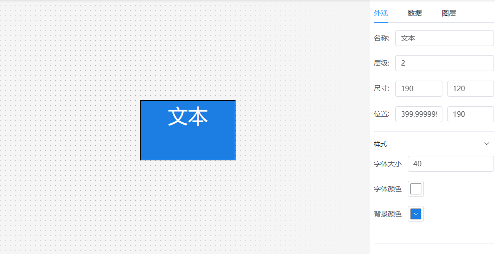
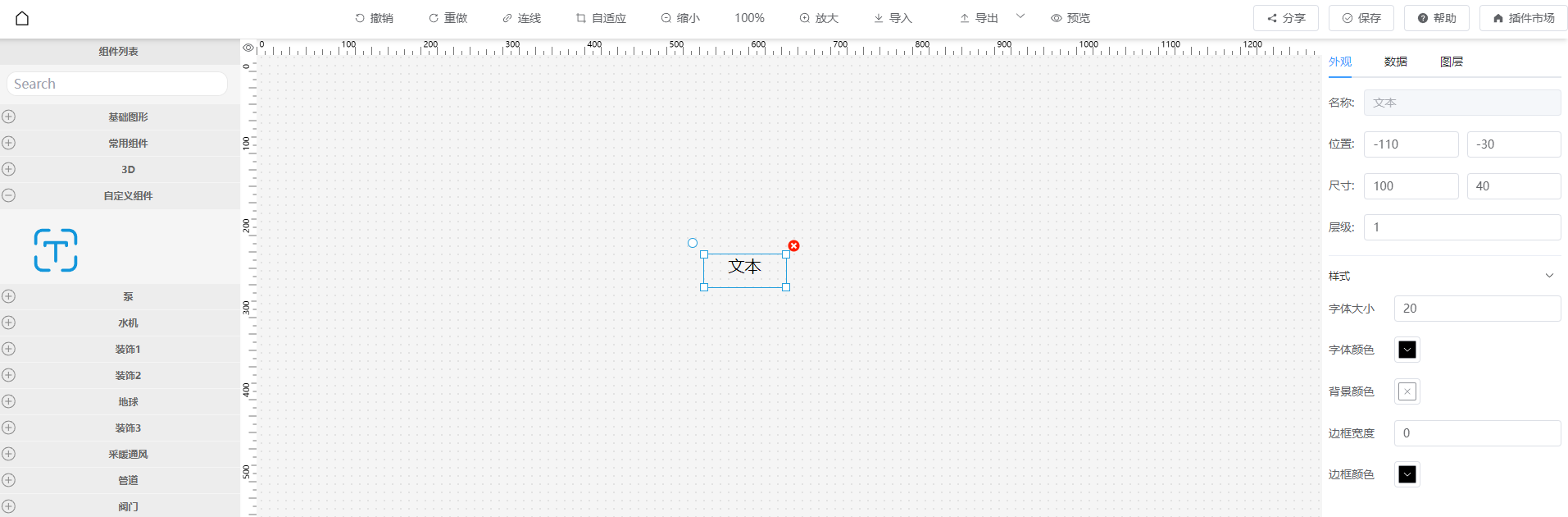
Using a text component as an example, we will develop a text component that can be dragged onto the canvas. Adjust text size, color, and background via the right property panel. Set text value via the data panel.
As shown below:
Video Tutorial
Documentation Tutorial
Step 1: Download visual-editor project
https://github.com/ThingsPanel/visual-editor Open with code editor.
Step 2: Create component files
The official plugins directory is src/plugins/tp-plugin.
To develop your own plugin, create a new folder in plugins directory. In this example, we create test-plugin.
A plugin can contain multiple components. Create a text directory inside test-plugin, then create the following files:
index.ts, Main.vue, Data.vue, Attribute.vue, default.ts, icon.svg.

Step 3: Write Main.vue
// text/Main.vue
<template>
    <div :style="myStyle" style="width:100%;height:100%">
        {{ value }}
    </div>
</template>

<script>
export default {
  components: {},
  props: {
    value: {
      type: [String],
      default: "Text"
    }
  },
  data() {
    return {}
  },
  computed: {
    myStyle() {
        if (this.style) {
            return this.style
        } else {
            return {
                fontSize: '20px',
                fontColor: '#ffffff',
                backgroundColor: '#409EFF',
                border: '1px solid #000'
            }
        }
    }
  },
  methods: {}
}
</script>
<style lang="scss" scoped></style>
Step 4: Write Attribute Panel Attribute.vue
// text/Attribute.vue
<template>
    <el-collapse v-model="activeNames">
        <el-collapse-item title="Style" name="style">
            <el-form v-model="formData">
                <el-form-item label="Font Size">
                    <el-input v-model="formData.fontSize"></el-input>
                </el-form-item>

                <el-form-item label="Font Color">
                    <el-color-picker v-model="formData.color" />
                </el-form-item>

                <el-form-item label="Background">
                    <el-color-picker v-model="formData.backgroundColor" />
                </el-form-item>
            </el-form>
        </el-collapse-item>
    </el-collapse>
</template>

<script>
export default ({
    data() {
        return {
            activeNames: 'style',
            formData: {
                fontSize: 20,
                color: '#ffffff',
                backgroundColor: '#409EFF'
            }
        }
    },
    watch: {
        formData: {
            handler(val) {
                // Pass style to Main.vue on change
                this.$emit("onChange", {
                    style: { ...val, fontSize: val.fontSize + 'px' }
                });
            },
            deep: true
        }
    }
})
</script>

<style lang="scss" scoped></style>
When user changes values in the property panel, the canvas node needs to reflect it.
Use vue's emit to pass onChange event.
this.$emit("onChange", {
    style: {
        fontSize: 20,
        // ...
    }
});
The editor will pass style to Main.vue, received in props.
Currently supports passing style and data.
Step 5: Write Data Panel Data.vue
// text/Data.vue
<template>
  <div style="height:100%">
    <el-row style="margin-bottom: 10px">
        <el-radio-group v-model="formData.bindType">
          <el-radio v-for="item in bindOptions" :label="item.value" size="small">{{ item.label}}</el-radio>
        </el-radio-group>
    </el-row>
    <el-row style="height:100%">
        <!-- Static Data -->
        <el-input v-if="formData.bindType==='static'" :rows="20" type="textarea" v-model="formData.static"></el-input>
        <!-- Dynamic Data -->
        <el-form-item v-else-if="formData.bindType==='dynamic'" style="width:100%">
          <el-input :rows="2" type="textarea" v-model="formData.dynamic"></el-input>
        </el-form-item>
        <!-- Device Data -->
        <div class="w-full" v-else-if="formData.bindType==='device'" >
          <slot></slot>
        </div>

    </el-row>
  </div>
</template>

<script>
export default {
  props: {
    data: {
      type: [String, Object],
      default: () => ({})
    }
  },
  data() {
    return {
      formData: {
        bindType: 'static',
        static: "Text"
      },
      bindOptions: [
        { value: 'static', label: 'Static Data' },
        { value: 'dynamic', label: 'Dynamic Data'},
        { value: 'device', label: 'Device Data'}
      ]
    }
  },
  watch: {
    formData: {
      handler(val) {
        this.$emit("onChange", {
          data: { bindType: this.bindType, ...val }
        });
      },
      deep: true
    }
  },
  mounted() {
    if (JSON.stringify(this.data) !== "{}") {
      this.formData = JSON.parse(JSON.stringify(this.data));
    }
  },
  methods: {

  }
}
</script>
<style lang="scss" scoped>
.el-radio.el-radio--small {
  margin-right: 10px
}
</style>
Step 6: Export Component
Export in text/index.ts.
import Text_Attribute from './Attribute.vue';
import Text_Data from './Data.vue';
import Text_Main from './Main.vue';
export { Text_Attribute, Text_Data, Text_Main }
Step 7: Configuration
Configure in test-plugin/index.ts.
import { Text_Attribute, Text_Data, Text_Main, Text_Icon } from "./text";

export default {
    views: [
        {
            name: "Text",      // Component name, must be unique
            description: "",
            group: "Custom Components",   // Group name in left list
            icon: Text_Icon,         // Icon (base64 or url)
            size: { width: 120, height: 60 },
            type: "text",     // Type: text | switch | dashboard | pie | histogram | curve | table | map | video | 3d
            Main: Text_Main,    // Node to render
            Attribute: Text_Attribute,   // Attribute panel form
            Data: Text_Data    // Data panel form
        },
        {
            ...
        }
    ]
}
Step 8: Export Plugin
Export in src/plugins/index.ts.
import testPlugin from './test-plugin';
export default { testPlugin }
Done.
Run pnpm run dev.
The text component should appear.
Left Component List:

Drag to Canvas:
Step 9: Publish Plugin
After testing, publish to the plugin market. Publish Plugin